Domino Apps include built-in usage analytics to help you monitor engagement, track adoption, and spot trends over time. Everything is available directly in the UI, with no additional setup required.
This section explains how to access the Usage tab, interpret available metrics, and apply these insights to improve your App’s performance and reach.
Accessing the usage tab
To view usage:
-
Open your App’s detail page.
-
Click Usage (next to Overview).
At the top of the tab, you’ll see:
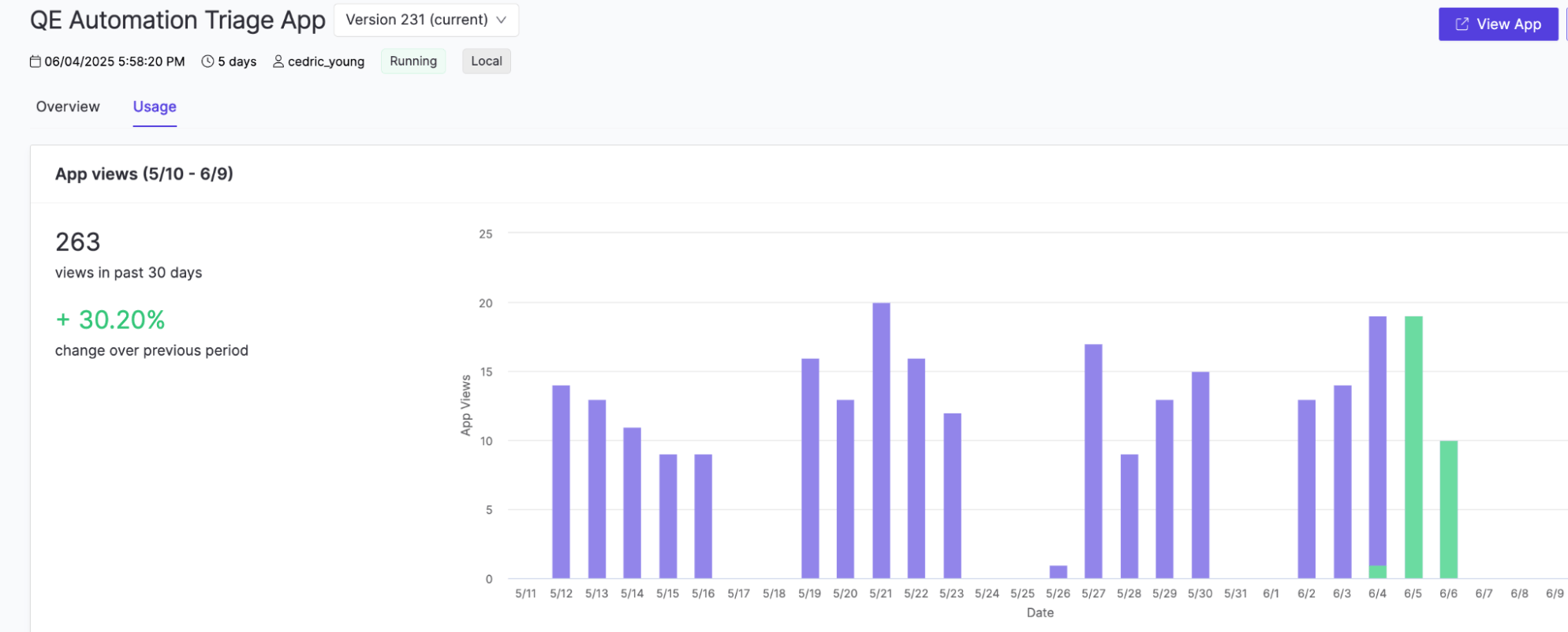
Total views and period comparison
This section shows how many times your App has been accessed and how that compares to the previous month.
-
Views in past 30 days: Total number of HTTP requests to your App, for example,
263.
-
Change over previous period: Percentage increase or decrease compared to the prior 30-day window, for example,
+30.20%.
Daily views chart
This chart helps you visualize usage patterns over time.
-
Each bar represents the number of App views on a specific day.
-
Hover over a bar to see the exact count, like
14 views on Jun 3.
Version-specific filtering
Use the Version dropdown to filter metrics:
-
All versions (default): Aggregated data.
-
Select a specific version to view usage for that version only.
-
Green bars indicate the currently deployed version.
Interpret the data
The resource metrics chart provides insight into how your app is being used over time. You can uncover trends that inform performance tuning, capacity planning, and user engagement strategies, by analyzing usage patterns such as spikes, steady growth, or sudden drops.
Use trends in the usage data to understand how your App is being used:
-
A steady increase = Growing engagement.
-
Spikes = Demos, training sessions, or automation.
-
Drops = Autosuspends, errors, or reduced interest.
Review logs or gather user feedback to investigate anomalies. These insights can help you improve performance, plan for growth, and boost adoption.
Monitor resource consumption
Domino Apps include built-in resource monitoring to help you track real-time CPU and memory usage. This visibility aids in troubleshooting, performance tuning, and choosing the right hardware tier.
The panel provides historical data, visual insights, and best practices for optimization.
Access the resource consumption panel
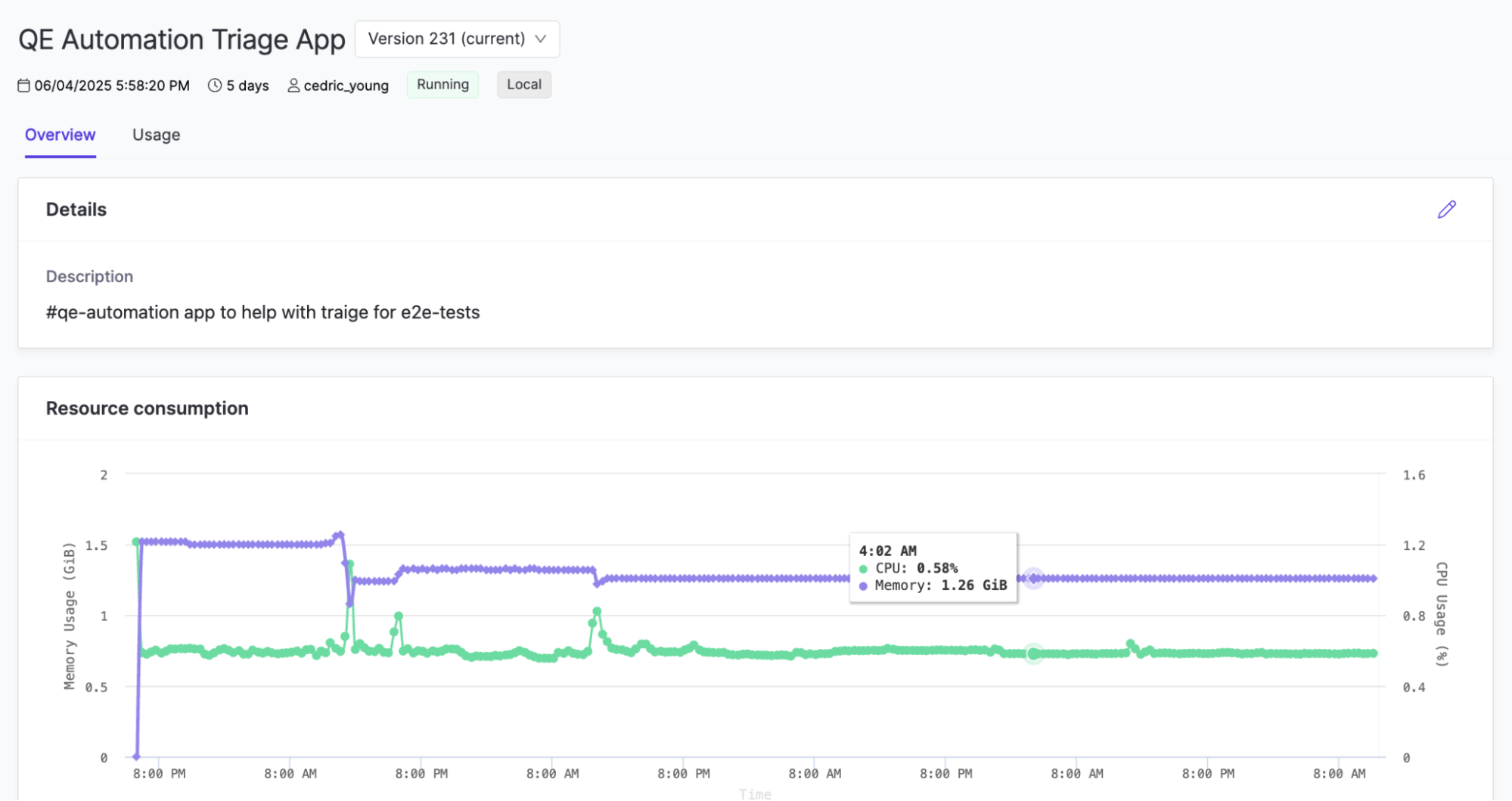
You can monitor an app’s hardware usage (such as CPU, memory, and GPU) using the Resource Consumption panel available in the app’s Overview tab. This helps you understand performance over time, diagnose resource-related issues, or fine-tune compute settings.
Resource data is retained for the previous 15 days; if no data is available for that window, the panel displays a message indicating that no chart is visible.
Understand the chart
The chart displays CPU and memory usage over time for the selected App instance. Use the instance selector to view metrics from another start of the same version.
-
Memory Usage (GiB) → Purple line (left Y-axis).
-
CPU Usage (%) → Green line (right Y-axis).
-
Time (last 15 days) → X-axis.
Hover over any point to see timestamp, memory usage, and CPU percentage.
Key insights
Beyond general usage patterns, the resource chart can reveal deeper operational insights about your app’s performance. Tracking these signals helps you validate resource sizing, detect inefficiencies, and identify opportunities to optimize memory or compute behavior.
Use the chart to identify these trends in resource usage:
-
Baseline usage: Confirms App fits within allocated resources.
-
Spikes: May occur during data loads or visualizations.
-
Gradual increases: Can indicate memory leaks or inefficiencies.
Data retention and external monitoring
Domino retains resource data for the past 15 days only.
For long-term tracking or alerting:
-
Forward metrics to external monitoring systems, such as Prometheus + Grafana, or Splunk.
-
Use the Domino API or a sidecar exporter to stream data.
Best practices for resource optimization
-
Right-size early: Scale up if usage consistently exceeds 80%.
-
Optimize hot paths: Link resource spikes to specific features or actions.
-
Set limits and alerts: Work with admins to configure quotas and alerts.
By monitoring and optimizing usage, you can improve stability, enhance UX, and ensure efficient use of hardware resources.
Next steps
Last modified on September 3, 2026